Scalable Design System for B2B SaaS Product
Building a shared design language that reduced design debt, improved consistency, and helped product teams ship faster across a growing SaaS platform.

Client:
Confidential B2B SaaS Product
Category:
Design System • Product Design • Enterprise SaaS
My Role:
Lead Product Designer
Building Flame — A Scalable Design System for Xoxoday
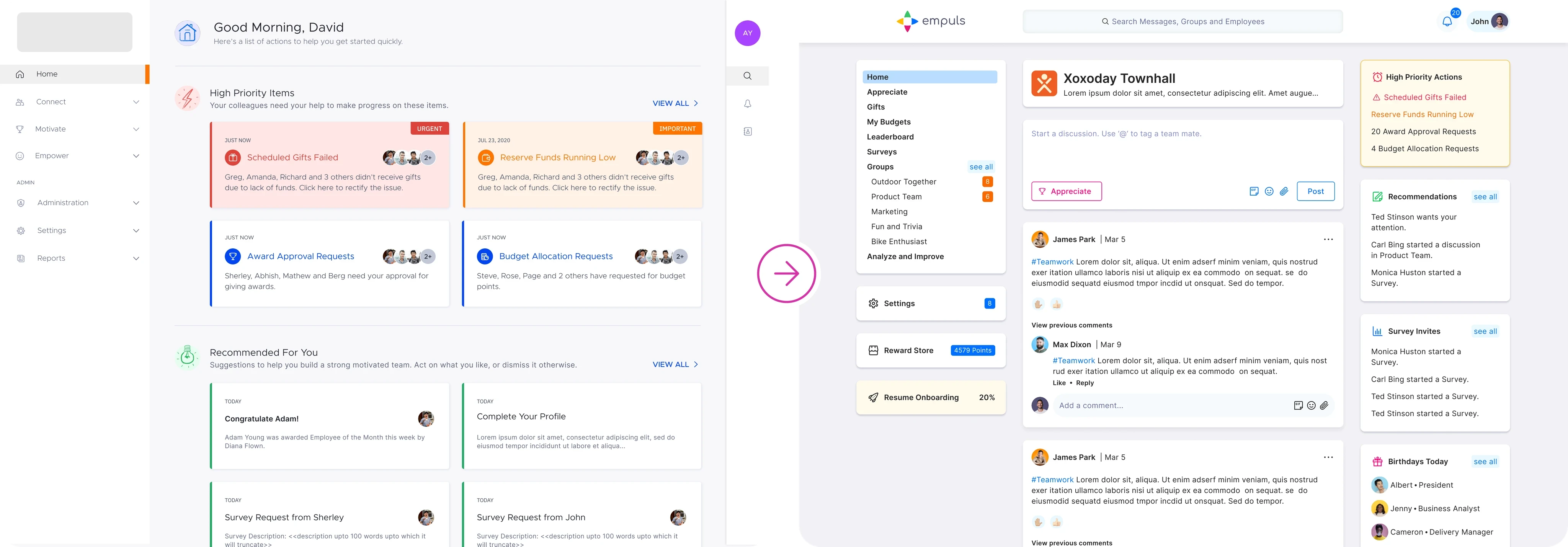
Creating a shared design language that unified product experiences, accelerated development, and enabled teams to build consistently at scale.
As Xoxoday’s product ecosystem expanded across multiple modules and teams, maintaining consistency became increasingly challenging. Designers were solving similar problems differently, while engineers repeatedly implemented the same patterns with slight variations.
To address this growing complexity, I led the design and evolution of Flame, Xoxoday’s enterprise design system. Rather than creating a UI library, the objective was to establish a scalable product language that connected design, engineering, and product teams through shared principles, reusable components, and comprehensive documentation.
Flame became the foundation for building faster, improving consistency, reducing design debt, and enabling teams to focus on solving customer problems instead of recreating interface patterns.
Problem — Growing Design Debt
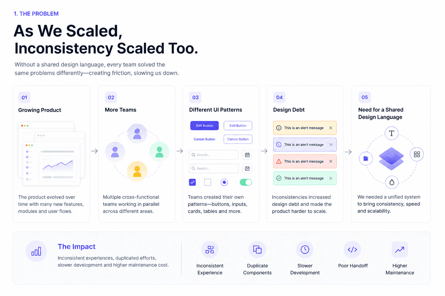
When Products Grow Faster Than Their Design System
As new products and features were introduced, UI patterns evolved independently across different teams. Similar interactions looked different from one module to another, resulting in inconsistent user experiences and increasing maintenance costs.
Without a centralised system:
Components were duplicated across products.
Buttons, forms, tables, and navigation behaved inconsistently.
Designers recreated existing patterns instead of reusing them.
Developers implemented similar interfaces multiple times.
Design reviews focused on UI inconsistencies instead of product problems.
The absence of a shared design language slowed product delivery and reduced overall experience quality.
Goal
Create a unified system that would establish consistency, improve collaboration, and scale with future products.
Research - Audit & Findings
Understanding the Existing Experience
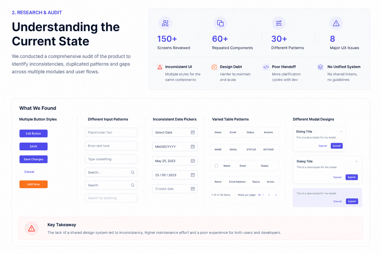
Before designing any components, I conducted a comprehensive audit of existing product interfaces.
The objective wasn’t to identify visual inconsistencies alone—it was to understand how teams were solving similar problems differently.
The audit included:
Existing UI components
Interaction patterns
Product modules
Design files
Engineering implementation
Accessibility considerations
This research highlighted recurring patterns, duplicated work, missing standards, and opportunities for standardisation.
This research highlighted recurring patterns, duplicated work, missing standards, and opportunities for standardisation.
Key Findings
Multiple variations of common components
No standardised spacing or typography
Repeated implementation effort
Limited documentation
Inconsistent interaction behaviour
No shared governance process
These findings directly informed the architecture of the design system.
Foundations - Colors, Type, Grid, Spacing
Designing the Foundations Before the Components
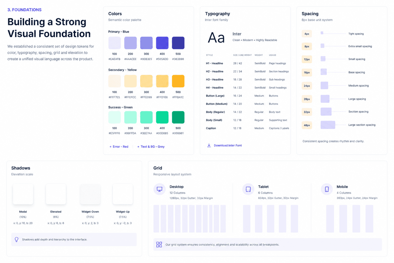
Rather than immediately creating reusable UI components, I established the core foundations that every interface would inherit.
This ensured every future component would share the same visual language and interaction principles.
The foundation included:
Semantic color tokens
Typography scale
Responsive layout grids
Spacing system
Elevation
Shadows
Border radius
Iconography
These primitives reduced design decisions while making interfaces more predictable and accessible.
The result was a flexible foundation that supported both current and future product experiences.
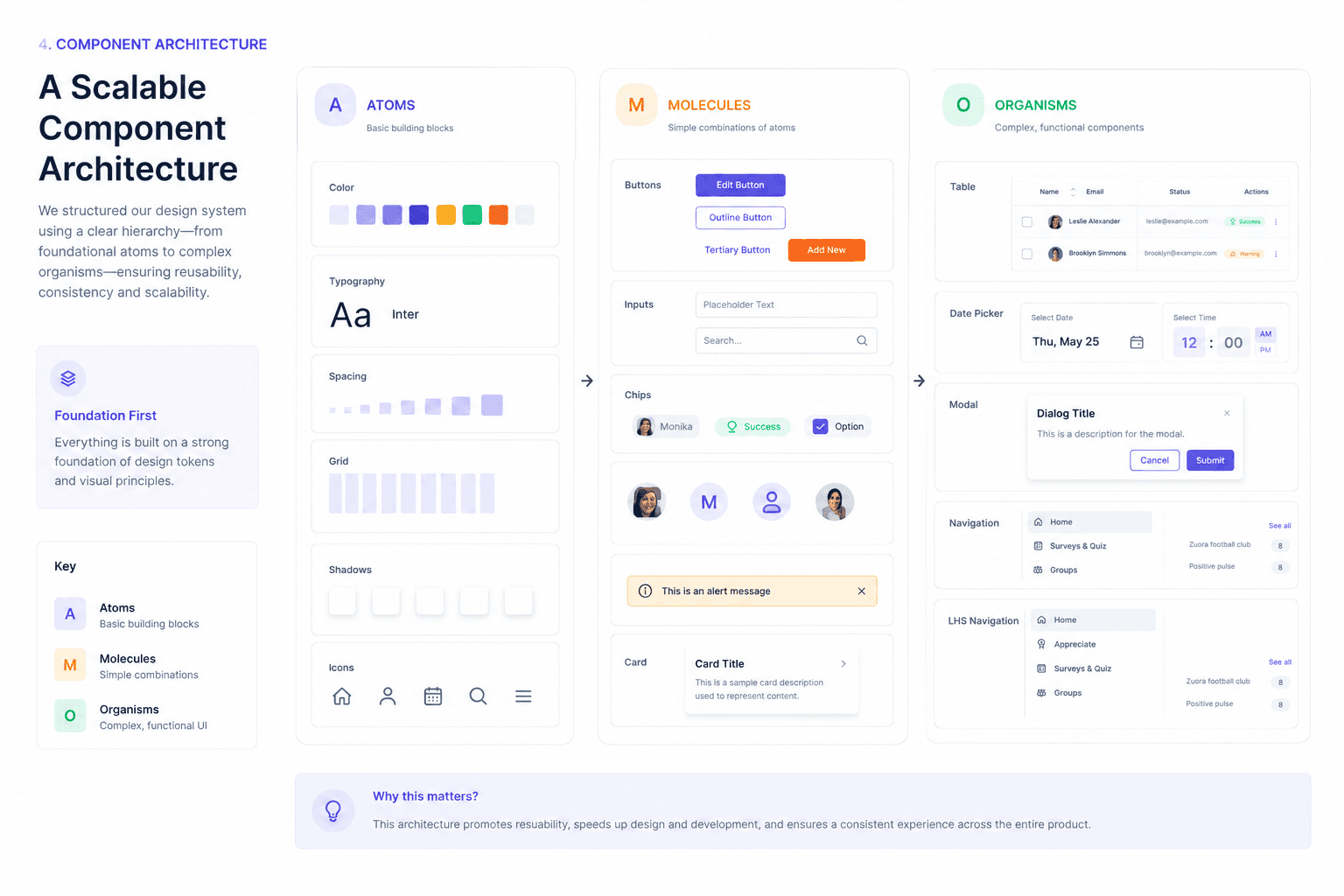
Architecture : Atoms → Molecules → Organisms
Building a Scalable Component Architecture
To ensure long-term scalability, the system was structured using Atomic Design principles.
Instead of creating isolated screens, every interface was built from progressively reusable building blocks.

Component Showcase
A Library Designed for Real Enterprise Products
Flame evolved into a comprehensive library of reusable components designed specifically for enterprise SaaS applications.
The system included foundational UI elements alongside complex data-heavy components frequently used across Xoxoday products.
The library covered:
Buttons
Tables
Cards
Navigation
Forms
Date Picker
Modals
Banners
Empty States
Avatars
Feedback Components
Data Visualizations
Each component supported multiple variants, interaction states, responsive behaviour, and accessibility guidelines.
Rather than documenting isolated UI elements, every component was designed as part of a connected ecosystem.
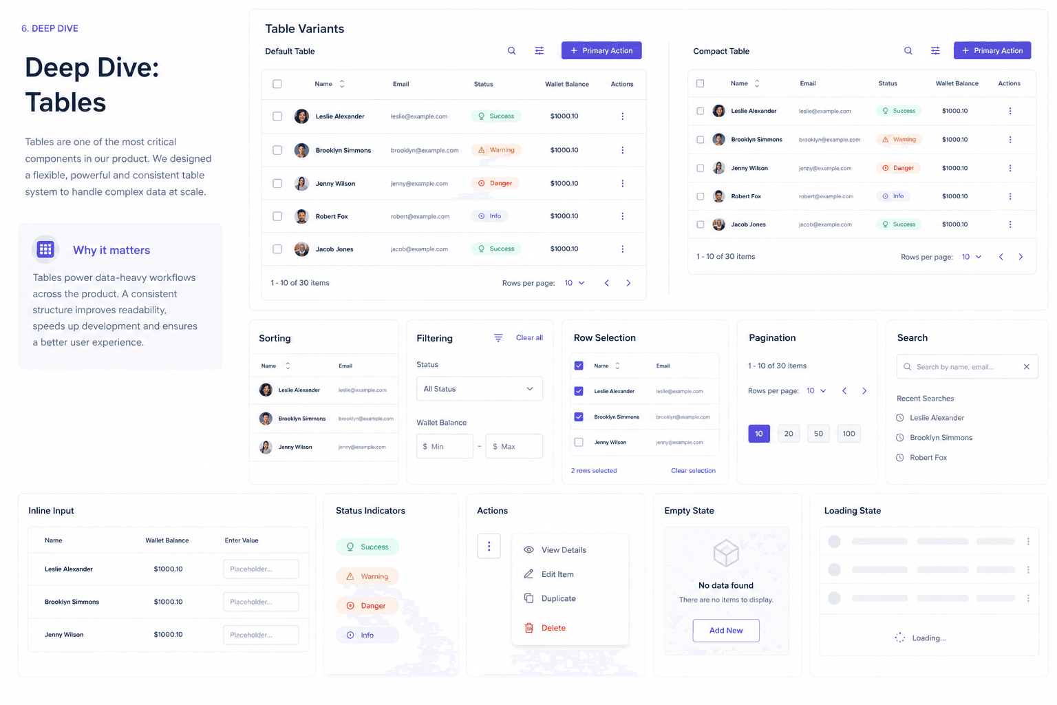
Deep Dive - Tables
Designing One of the Most Complex Enterprise Components
Tables are one of the most heavily used components across enterprise software.
Instead of designing a single table, I created a flexible system capable of supporting multiple product scenarios.
The component included:
Sorting
Filtering
Search
Bulk Selection
Pagination
Inline Actions
Status Indicators
Avatars
Responsive Layout
Empty States
Each variation followed consistent interaction patterns while remaining flexible enough for different product teams.
The standardized table significantly reduced design effort while providing engineers with a predictable implementation model.
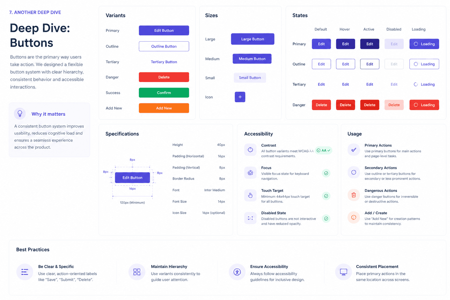
Deep Dive - Buttons
Standardising the Smallest Component With the Biggest Impact
Buttons appear throughout every product experience, making consistency essential.
The button system was designed to support multiple interaction scenarios while remaining simple to use.
The library included:
Primary
Secondary
Tertiary
Ghost
Icon Buttons
Destructive Actions
Loading States
Disabled States
Each variant included clear usage guidelines, accessibility considerations, sizing rules, and implementation specifications.
By reducing ambiguity around button usage, designers could make faster decisions while maintaining visual consistency.
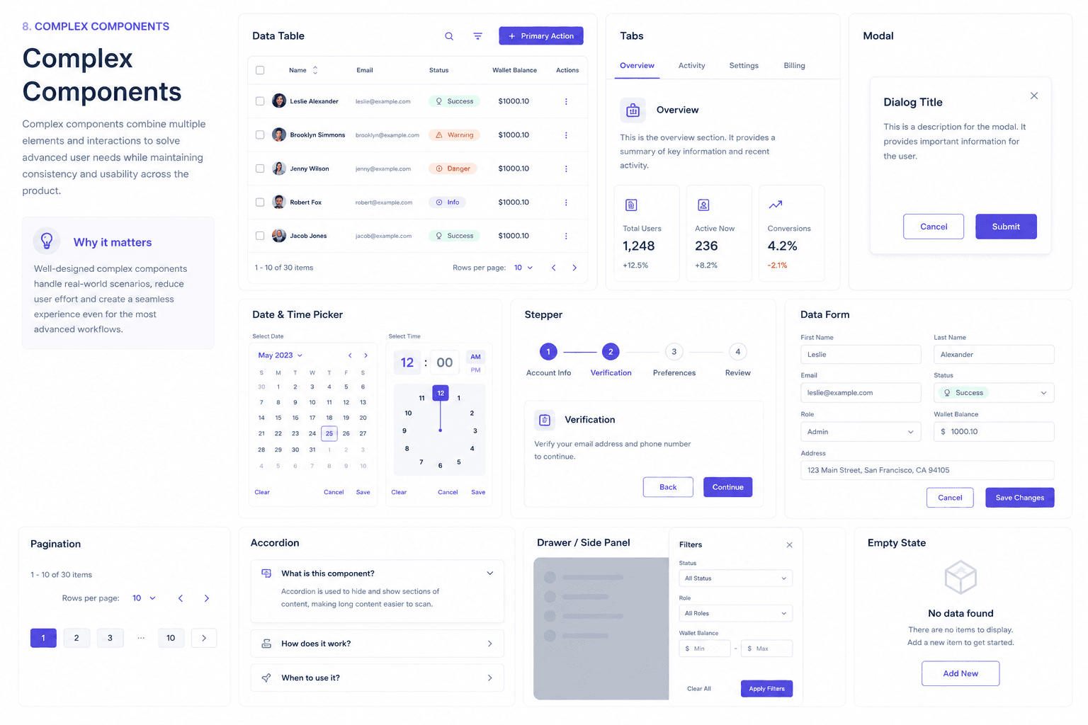
Documentation & Governance
Design Systems Don’t Scale Without Governance
Creating components was only part of the project.
Long-term success depended on clear documentation, shared ownership, and collaboration between design and engineering.
Every component included:
Usage Guidelines
Anatomy
Variants
Interaction States
Accessibility Notes
Spacing Rules
Content Guidelines
Developer Specifications
Documentation was synchronized with Storybook, enabling designers and developers to reference the same source of truth throughout the product lifecycle.
This governance model encouraged adoption while ensuring the system evolved consistently as new product requirements emerged.

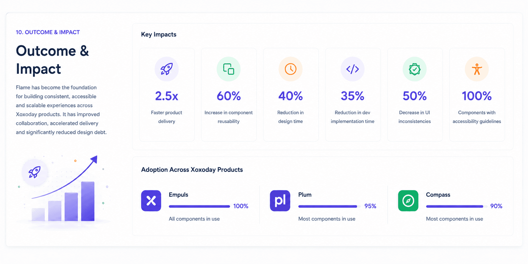
Outcome & Impact
Creating a Foundation for Product Scale
Flame transformed the way product teams designed and built user experiences.
Instead of recreating interfaces, teams could assemble products using a shared library of reusable building blocks.
The design system improved collaboration, reduced inconsistency, and accelerated product delivery while establishing a scalable foundation for future growth.
Outcomes
Established a unified visual language across products.
Reduced duplicated design and engineering effort.
Improved consistency throughout the platform.
Accelerated design-to-development handoff.
Increased component reuse across teams.
Simplified onboarding for designers and developers.
Created a scalable foundation for future product development.
Reflection
The most valuable outcome wasn’t the number of components created - it was the shift in how teams worked together.
Design conversations moved away from rebuilding UI patterns and toward solving customer problems. By establishing a shared design language, Flame became more than a component library; it became an essential part of Xoxoday’s product development process.
Related Projects

